Pilgrimage to Giverny

20140709-_DSC8022

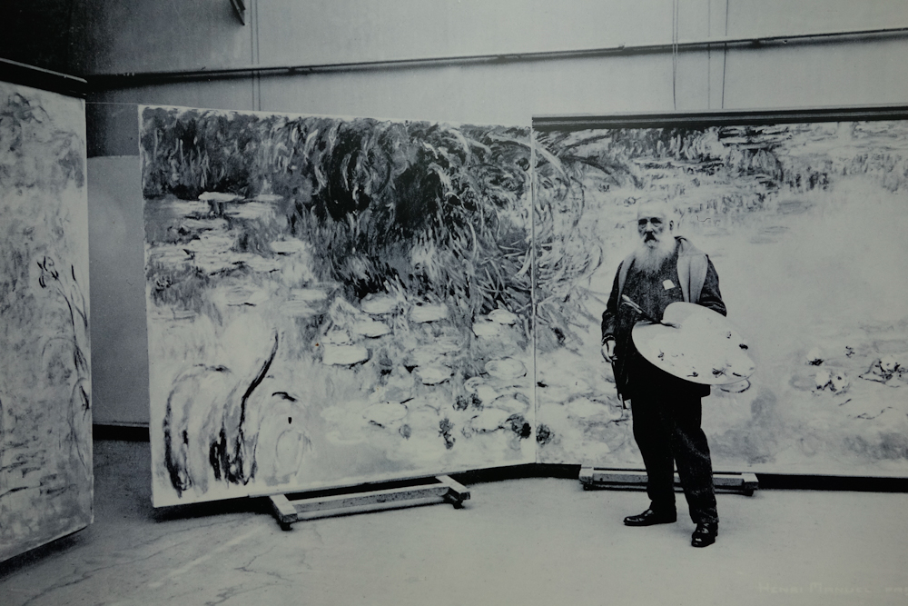
Monet in his studio, working on the paintings that would line the galleries of l’Orangerie Museum in Paris.

Water lilies and reflections are one of my favorite subjects to paint. With three days in Paris this past July at the end of a painting trip in France, my top priority was a day trip to Giverny to visit Monet’s home and gardens, especially his water garden.

As a child I sat mesmerized before Monet’s paintings in the Art Institute of Chicago, the National Gallery in DC, and later at the Met and MOMA in New York. But the first time I visited l’Orangerie in Paris, surrounded on all sides by the magnificent murals that Monet created in the last years of his life, I felt that I was actually sitting at the side of the artist by his beautiful lagoon.

This time in Paris I hoped to visit the Louvre, the Orsay, the Musee Marmotan, and perhaps the Rodin Museum! Or at least as many of those places as I could. But I arrived at the Louvre to find the square FULL of people. It was the first Sunday of the month, and the museums were free. The place was mobbed. Same story at the Orsay. So I found myself again at l’Orangerie, and was able to get in with only a half hour wait.

It was wonderful to see these paintings again before my trip to Giverny. Downstairs a show on collector and dealer Paul Guillaume included miniature rooms from his apartment in Paris complete with tiny models of his African art collection! It reminded me of the hours I spent staring into the miniature rooms at the Art Institute of Chicago when as a child, I went to work with my dad! African art inspired and excited Guillaume, and many of the contemporary artists he represented such as Cezanne, Derain, Modigliani. I thought of my dad, who introduced me to the joys of museums, and always supported my exploration of art. He would have been as thrilled as I was to be there.

One of the miniature room s in the Orangerie, showing Paul Gilluame's collection of paintings and African art.

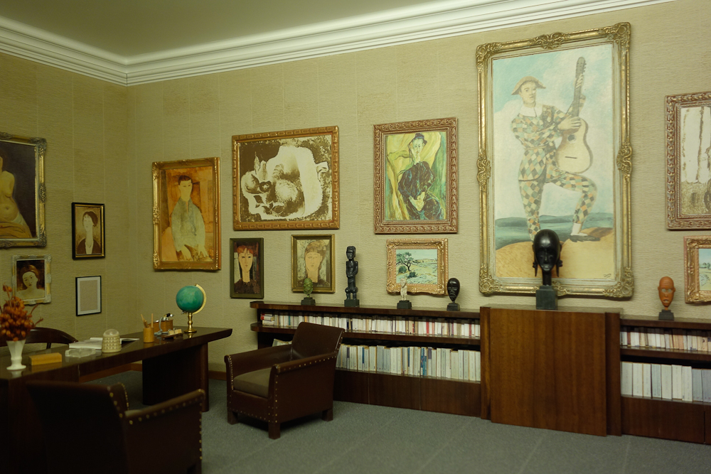
One of the miniature rooms in l’Orangerie, showing Paul Gilluame’s collection of paintings and African art.

When I emerged from the museum it was pouring. Soaked, I considered but gave up on my plans to visit any more museums, deciding that I had absorbed enough art and water for one day.

Mary, one of the other artists on the pastel trip, and I planned to rendezvous in Giverny on Monday. That morning I was at Gare St. Lazare, tickets in hand, waiting to see what platform the train would be on, when it suddenly disappeared from the board. Electrical problems in Rouen caused all the trains to be canceled on that line that day. Mary was staying in Rouen and was stranded as well. Disappointed, I took my pastels and went over to the Jardin des Plantes to do a little plein air painting.

The next day we resolved to try again. The forecast was calling for showers and then steady rain, so I left my pastels at the hotel. Mary is an optimist, so she brought hers along. We met at the station in Vernon, and boarded the bus to Giverny. We got to the gardens around 9:45, and it was already packed with tours. Resolved to see the water garden while the weather held, we leapfrogged the groups, and made our way directly there.

20140709-_DSC7733

The top of Monet’s big pink house is just visible above the garden.

Mary and I inched our way around the pond, so happy to be there, taking it all in. The sun actually came out for a while, but mostly the sky was like a giant soft box, perfect for photography. We even cracked out our paints, Mary her pastels, and me a small watercolor kit, and painted for a little while before it started to pour.

Surprisingly, the garden was even more beautiful in the rain! The water lilies opened up along with all the colorful umbrellas. The pattern of rain on the water, the calligraphy of the willow branches in front of the pond!! I felt transported into one of Monet’s paintings, just soaking up the beauty of the place. My shoes were also soaking, unfortunately. But I had my borrowed umbrella from the hotel, and I couldn’t have been happier to be where I was at that moment.

Willow branch caligraphy.

Willow branch calligraphy.

20140709-_DSC7872

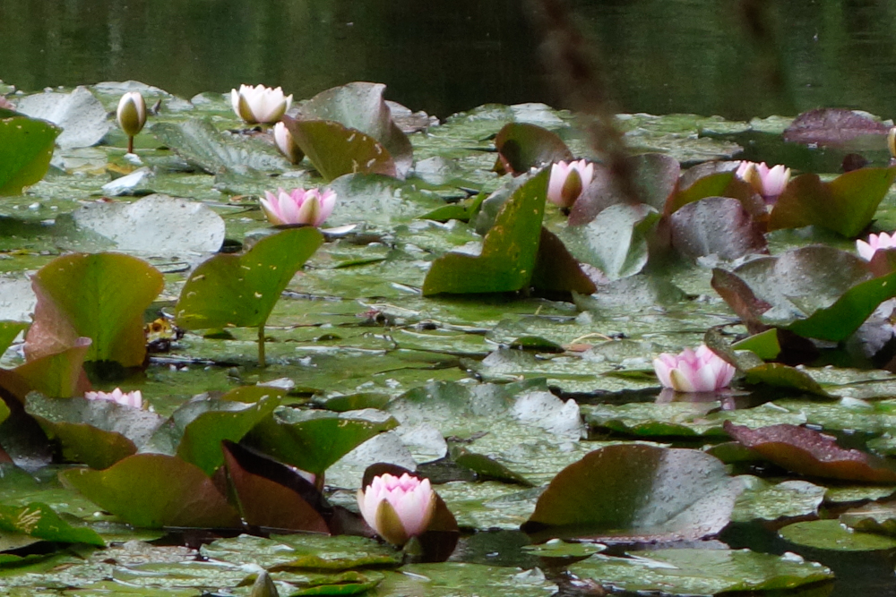
The lilies opened up in the rain.

The umbrellas add to the color.

The umbrellas add to the color.

The inspiration for my my painting "After the Rain"

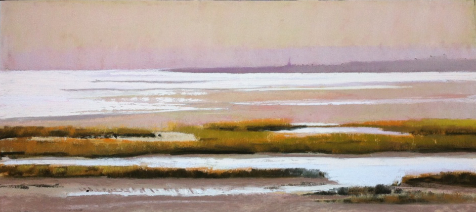
The inspiration for my painting, “After the Rain”.

Another miniature room, Monet's studio, for sale in the gift shop.

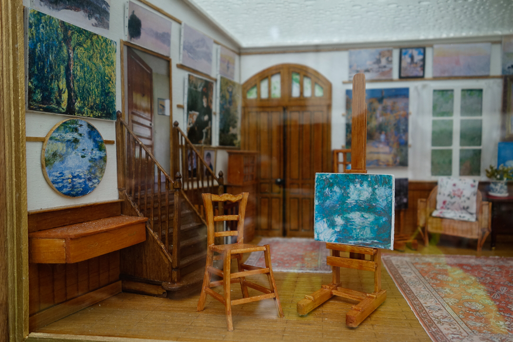
Another miniature room, Monet’s studio, for sale in the gift shop.

Monet’s house was charming, and a walk though the village gave us glimpses of Giverny as it was in Monet’s time. Mary and I hugged goodbye, both of us so happy to have been able to share the experience with a like-minded traveler.

For Pastels Only in Cape Cod, 2014

Mad River

Mad River, 12 x 18, Pastel on UArt

Sponsored by the Pastel Painters Society of Cape Cod, this national juried pastel exhibition was held annually at the Cultural Center of Cape Cod on Old Main Street in South Yarmouth, MA. It includes some of the best pastelists working today.

I have been honored to be included for the past three years. My painting Mad River was chosen to be included this year.

I started this painting on the banks of the Mad River in Vermont, with my easel set up on the rocky bank. Every so often a bit of spray would land at my feet.

I was able to complete the underpainting and block in the painting onsite, and later developed the painting further in my studio. Parts of the original underpainting still show through in the rocks and  river.


MAC Holiday Artisan Fair December 7, 2013

Artisan_Fair_DianeCome visit me at the Holiday Artisan Fair in Milton MA. I will have a number of unframed works available along with framed Pastels and Giclees.

Do your holiday shopping locally!! Over a dozen artists and artisans will be selling their work, and there will be a Super-Secret Elf Gift Workshop for young elves from 11-2, an Ornament Making Party for the town tree, and Santa will visit from 2-3pm. Looking forward to seeing you.

PPSCC Members Show


DRS_Into_the_LightMy Pastel “Into the Light” was included in the 2013 Pastel Painters Society of Cape Cod annual members show at the Mashpee Public Library. The Members Show Reception was held Saturday, November 23 from 1:00 pm to 3:00 pm. At 1:00, Margaret Farrell Bruno, PSA and PPSCC Signature Member presented a free Pastel Demonstration “Capturing a Quick Likeness in Pastel.”

Artist Showcase at the MAC

The Barn at Olana

The Barn at Olana

It was a great pleasure to be the featured artist at the Milton Art Center on November 9, 2013 from 12 – 4pm. It was wonderful to see old friends and meet new ones, as people dropped into the art center for the show and demonstration.

I shared some of my recent work, including field studies and finished paintings from Massachusetts, Vermont, Upstate New York, and Vancouver Island.  I also did a demonstration in soft pastel, showing the process I use, from underpainting to finished work.  During the demo I talked about how I use field studies done outside on location as references for final paintings to be done in the studio. I got great comments from the audience, many of whom had not seen the process of building a pastel painting before. It was great fun to share my love of pastels with such a wonderful group.

Diane holding a plein air sketch from Vancouver Island

Diane holding a plein air sketch from Vancouver Island

A wonderful audience!

A wonderful audience!

My ipad is a great tool for reference. here I am explaining compositional choices.

My iPad is a great tool for reference.

20131109_6320

Thanks to Maureen Fahey for the photos of the event!

Finding Your Focus

As much as possible I like to paint outside. Its not always possible to do this of course, so I spend a lot of time taking photos of things. These form a collection of visual notes that I can scroll back to, looking for ideas and inspiration.

While great for reference, photos often don’t really capture what excites you in a scene. If you can, its helpful to make some sketches or notes soon after. What was the quality of the light? What caught your eye and inspired you to stop and look? While the camera sees and captures a whole scene, our eyes will focus on that one detail that excites us. Often this detail is obscured by the myriad other details surrounding it in a photograph. Refining your vision and focus is an important first step in creating a painting.

When I was driving home from a plein air workshop this past summer I was struck by the beauty of the late afternoon light on the water on the bay. Shades of pink and mauve alternating with silver lines of light on the water faded into mist at the horizon. The pink sand was punctuated closer to shore by the graphic lines of reeds.  It was a stunningly beautiful moment. I pulled my car off the road and quickly took a few photos. While capturing something of the design of the scene, the photo below is a poor replica of the scene before me. I filed it away, but the memory of that pink evening light stayed with me.

pink_source

One day this spring, I pulled out the photo and began to do some preliminary sketches for a painting. I made the sketch below with some color notes.

sketch_pink2

I decided that getting the color right was really going to be the challenge, so it would make sense to start with a smaller study to refine the color palette.

pink1

First I transferred the sketch onto a small piece of  UArt and laid in some color for an underpainting. I wanted to set up the play of warms and cools from the beginning, so used oranges and purples. After washing this color down with alcohol, I began to lay in pastel over the underpainting, establishing the lightest lights and darkest darks.

pink2

More detail and texture is added to the sand and grasses, playing off the colors in the underpainting. My goal was to add as little pastel as possible, and yet make the scene come alive. I experimented with layering colors on a scrap of paper to create the effect I was looking for.

pink3

Perhaps because I was doing a study, it was easier for me to stop before going too far and losing the spontaneity of the piece. I developed a working palette, and with my notes began to think about tackling the larger piece.

As I began the larger piece, I used both the study and the original source photo as reference. In the image below, the final painting sits on the easel with the photo reference on my ipad above, and the study below. At this point I have completed the underpainting, and have established the dark and light.

Inevitably as I worked, the larger painting took on a life of its own, and I found that I needed additional colors. I struggled with the color of the grasses in the foreground, wondering whether to keep them very neutral  and dark as they appear in the photo, or follow my memory of the pink and golden glow.

photo2

The final painting developed over several days in which I worked back and forth between cool and light. I also was fighting the tendency to tighten up too much, and get too specific. At times I brushed out areas to soften them, and reapplied layers of fresh pastel.

The larger size of the final piece allowed me room to explore the color of the sky and atmosphere, and sharpen details in the grasses and water. While I miss some of the spontaneity of the sketch, I think the final painting is richer for it. Working on the sketch first allowed me the opportunity to develop my color palette, and refine the focus of the piece. The image below shows the piece as it was close to being finished. I had decided to abandon the lighthouse on the horizon, as I thought it was distracting. I was trying to resolve some issues in the foreground with the grasses and line of the dip in the shoreline, which was true to the photo.

Pink_final

In the final piece, I reinstated the lighthouse, although I relocated it to the left. I simplified the shoreline to allow your eye to pass over it, and go right to the orange grasses and water beyond, the focal point of the painting. I also added sparks of light in the grasses, because in my memory, the dance of the light on the water was such an important part of the beauty of the scene.

sandy_neck_final

I find that keeping a record of the progress of a painting like this is a great way to review your process and learn more about what what works and why. As the painting progresses ideas are lost and found. Seeing them again in the photo record allows you to return to them in another painting and push them further.

Happy painting!

FPO Show 2012

I am honored to have a painting included in the For Pastels Only show presented by the Pastel Painters Society of Cape Cod June 26-July 22, 2012. It was an impressive grouping of work by many well-known artists working in this medium. The opening was at the Cultural center of Cape Cod in South Yarmouth. It was fun to see many of the artists that I have met at various workshops this past year, and a pleasure to see so many beautiful paintings. White Beach Dawn, shown below, was selected for inclusion in the show. This painting of the white shell beach and Madrona trees along the rocky coast line of British Columbia’s Vancouver Island is set in one of my favorite places, Yellowpoint.

White Beach Dawn 12 x18

Show at Mad Hatter extended through first week in May

Owner Deb Fairbanks has decided to extend the show through the first week in May. Approximately 30 guests came by for our second artist reception on March 31st. We got great feedback on the work, and it was a pleasure to be there. Deb has done a wonderful job with the installation. Between the pastels (mine and Dave Kaphammer’s), the HD photography by Bjorn Bergsten, the lovely hangings by Catherine Hirsh, and the beautiful large sculptural pieces by Elizabeth Harrison there’s a lot to see. Plus you can get a great snack and a cup of Joe at the Coffee loft. Thanks everyone for coming! Tell your friends there’s still time to see the show! I’ll post some photos from the opening later on.

The gallery is at 406 Lincoln St. in Marlborough MA 508-251-1431

March 2012 Show at the Mad Hatter Gallery

I am pleased to be showing at the Mad Hatter Gallery March 16 through the beginning of April 2012. The show will be open Sat and Sunday afternoon March 17-18 and then 12-5 Tuesday through Friday for the rest of the month.

On March 31 from 4-5:30 the gallery will be open for an informal reception, as I was not able to make the official opening on March 16. Please come, take a look at my new work, and the work of 4 other talented artists including my friend and fellow pastel artist Dave Kaphammer.

20120317-204602.jpg

20120317-204647.jpg

Included in the show are these two images painted in Saint Lucia.

Gallery: Water images

Paintings done over the summer and fall of 2011. Click on a thumbnail to see a larger image.

I have been fascinated by water for years. The transparency of the water and its reflective surface present endless seductive details. Deciding what to capture, and rendering it so it is believable and fresh are the primary challenges.

White beach is painted as the brilliant dawn light illuminates the shell beach, driftwood, and Madrona trees of the Pacific Northwest.

The Houghtons’ Pond series explores the tension between three surfaces: reflected sky and light, the lily pads and leaves floating on the surface of the water, and the stems and pond floor below.

Off the Dock explores the colors of the surrounding summer landscape as it reflected in the gently rippling water. Cedar trees overhang the edge of the lake, creating mysterious eddies, dark and cool. A few shafts of light penetrate below the surface revealing the warm tones of the silty lake water.

Malibu Beach was captured from a cliff overlooking the beach. Purple shadows were enveloping the cliff face, but the hillside on which we stood was covered in succulents, bright orange and green in the sunlight. A guy on a surf board played tag with a seal in the waves below us.

If you missed the show, check out the video

Despite the record heat, many people came to the opening of my show at the library 7/21/11. I got some great feedback, lots of positive comments, saw many old and new friends, and by the end of the night had sold three pastels and two photos.

Much to my surprise, a reporter from the Patriot Ledger came as well to report on the opening. The video appears in video section of patriotledger.com.

To get a small glimpse of the show go to:

http://www.patriotledger.com/video/x1259737036/Diane-Sawyer-reception-at-Milton-Library

Opening at Milton Public Library, July 21, 2011

It was an interesting process installing my work at the library the past few days. As the show went up during hours the library is open, many people stopped and commented on the work on their way through the gallery. It was great to get such immediate feedback.

Most of the work is done in very soft pastels on a sanded paper. The sanded surface allows for colors to be layered over one another, creating a sense of space and atmosphere. Working with pastel is like working with pure pigment. The surface is touched as little as possible, except in areas like the sky, which is usually blended.

Most people seem surprised to hear that the work is done in pastel, as they seem more like paintings.

Over the past year since I began working with pastels I have gotten more skilled at using their special quality to the best advantage. Layering the pastel pigments has allowed me to explore light and color, and how they change over distance. I am particularly intrigued right now with water, how it reflects the sky, but also is transparent, with the objects below and above the surface combining in an ever changing mosaic. I am also very inspired by the light in these warm summer months, especially in the morning and the evening, when the sun is low in the sky.

I’ve just begun to explore this beautiful medium. I look forward to learning more and seeing more with each new piece. Thank you to Jeanne Rosier Smith, who so generously shares her insight and deep knowledge of the medium.

In addition to pastels, the show includes 8 photographs printed on an aluminum substrate. The aluminum substrate creates a luminous surface that beautifully displays the detail and color of the images. I am showing  five prints from a hydrangea series, and three tide pool images shot on Vancouver Island.

I hope you will be able to make it to the opening, or if not, to stop by the show while it is up through the end of August. I will be showing 21 pastels and 8 metal prints that represent my work over the past year.

I love pastels!

I have been working in pastels for only about 6 months. I started last spring after I met  Jeanne Smith and saw her beautiful work at the Framingham Open studios. Jeanne is an amazing artist and generous teacher. She holds classes in her studio in Sudbury.

For years I have worked in various other media including watercolor and oil. When I started work with pastels, I fell in love with the medium. It allows you to work directly with pure pigment, layering colors, seeing how they vibrate together without drying back or changing.

The new work I am showing at Framers Edge Gallery this fall and winter was done in various locations including, Yellowpoint Lodge on Vancouver Island, Cape Cod and the Boston Harbor Islands, and Vermont’s Champlain Islands.

The more I do, the more I learn. I am looking forward to creating paintings of the tidal marsh around my Quincy studio as the colors change from green to gold, tipped with orange.

I hope to see you at the opening . If you have any questions or comments about my work, please leave them here. I’d love to hear from you!

Diane